
Clear Cube Law Brand
Introduction
Clear Cube is a UK-based law firm made up of four senior lawyers who chose to work together because they believe brilliant tech companies deserve legal support that's as smart and straightforward as they are.
They’re not another law firm trying to look impressive. They’re experienced legal experts who got tired of working in places that prioritised corporate theatre over genuine client relationships. So they built something different.
This brand identity reflects who they are as people and professionals. Every visual choice, every word, and every client interaction reinforces that Clear Cube is legal expertise without the corporate nonsense: approachable but authoritative, transparent but sophisticated, and human but highly competent.
The Strategy Layer
Voiced for Clear Cube's perspective
The brand foundation
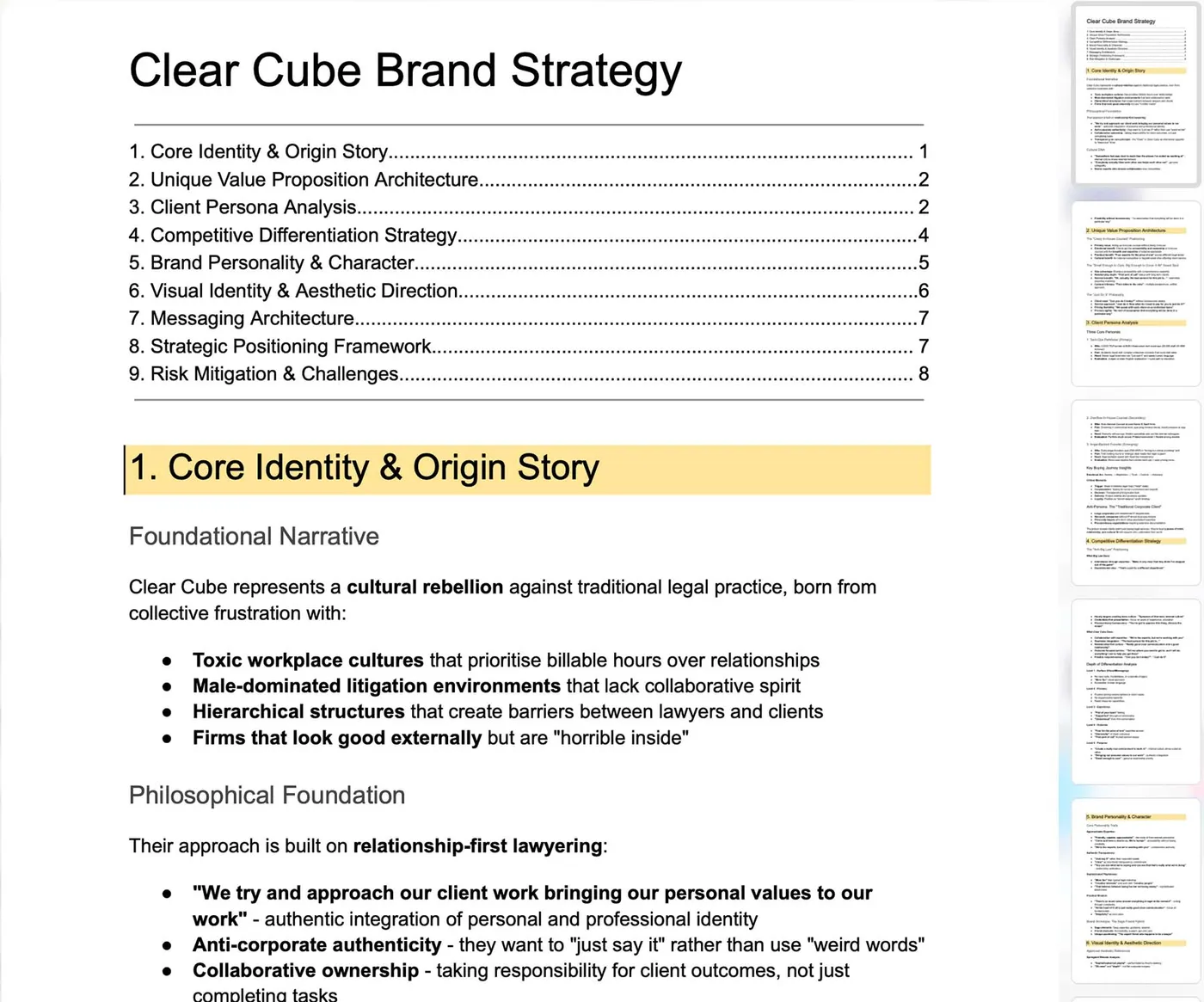
Clear, not black box: Most law firms operate like mysterious machines: you put in your problem and money, something opaque happens inside, and hopefully you get a solution. We believe in transparency. You should understand what we're doing, why we're doing it, and what it's costing.
Four experts, one conversation: Traditional firms shuffle you between departments when your IP question touches employment law or your commercial contract raises data issues. We work together seamlessly: Matt might lead on IP strategy, but Juliet weighs in on employment aspects, Anna covers commercial terms, and Alison ensures the corporate structure supports everything.
Small enough to care, big enough to cover it all: We're deliberately staying small enough to maintain genuine relationships with every client, but we've chosen our specialities to cover everything a growing tech company needs.
What Clear Cube stands for
Relationship-first lawyering: We believe the best legal work happens when everyone genuinely likes each other and helps each other out. That's our internal culture, and it's what we bring to every client relationship.
Practical over perfect: We understand the difference between "legally perfect" and "commercially sensible." Our job is to help your business succeed, not to create the most comprehensive legal framework imaginable.
Senior involvement, always: Every client works directly with the partners. No associates learning on your time. No partners who disappear after the pitch. When you have a question, you get an answer from someone with 15+ years of tech sector experience.
Authentic transparency: We speak with each client individually to design pricing that works for their business. No hidden costs, no legal jargon when plain English will do, no corporate BS when honest conversation is what's needed.
Clear Cube's purpose
We exist to help tech companies navigate legal complexity without the drama, bureaucracy, or intimidation that typically comes with serious legal expertise.
For our clients: We're the senior legal brains they can actually reach, who speak their language and care about their success.
For ourselves: We're creating the kind of workplace we actually want to be part of - collaborative, authentic, and focused on doing brilliant work rather than playing corporate games.
For the profession: We're proving that law firms can be genuinely approachable without sacrificing expertise, transparent without losing credibility, and human without being unprofessional.
Clear Cube's brand values
Transparency: We believe clarity builds trust. From pricing to process, we avoid jargon and “black box” practices. Our clients always know where they stand.
Authenticity: We bring our personal values into our work. What you see is what you get—straightforward advice, delivered with honesty and integrity.
Collaboration: We work as part of our clients’ teams and as a collective internally. There are no silos, no egos, just senior experts working together toward shared outcomes.
Agility: We move quickly and flexibly, without bureaucracy. When clients ask, “Can you do it today?” our answer is simple: just do it.
Collegiality: Our culture is built on respect, support, and genuine enjoyment of working together. A positive internal environment enables us to deliver our best externally.
Simplicity: In a noisy industry, we focus on clear communication and practical solutions. We cut through complexity to help clients achieve their goals.
Care: We’re small enough to know our clients deeply and big enough to handle their challenges comprehensively. Relationships always come before billable hours.
The 'vibe' inspiration
The vibe of the images combines three feelings at once: movement, order and depth. Lines and cubes point forward (progress), but everything sits on a tidy grid so nothing feels too chaotic. The overall feeling for the typography style is large and straightforward (letters you can easily read so they’re accessible), echoing the sense of clarity. Subtle depth and layered shapes add a touch of dimension, showing there’s thinking beneath the surface.
Overall: fast, modern, and firmly under control.
Primary Logo
Secondary Logo
The logo echoes the brand’s commitment to “cutting through complexity” and “simplicity as a core value". The shape above the wordmark can be read as a 3-D arrow pointing north-east.

Colour Palette
Primary
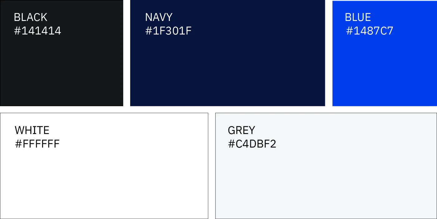
Near-black & deep navy: the solid foundation, professional, serious and reliable.
Vivid royal blue: the main signal colour, modern, confident and definitely tech-minded.
Soft light-grey: provides breathing room and keeps layouts clean and readable.
Accents
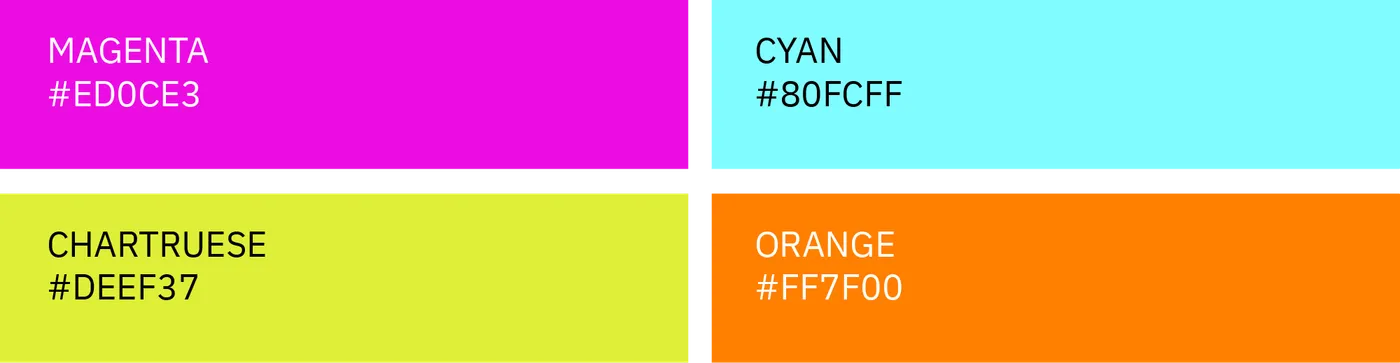
Chartreuse, punchy magenta, bright cyan, and sunset orange act as quick flashes of energy. They show speed, innovation and a little boldness without overwhelming the brand.
Typography
Slide 1 of 2
Slide 1 of 6